Pentair
ScreenLogic Home Pool Control
Updating a comprehensive home automation system

Getting the temperature just right
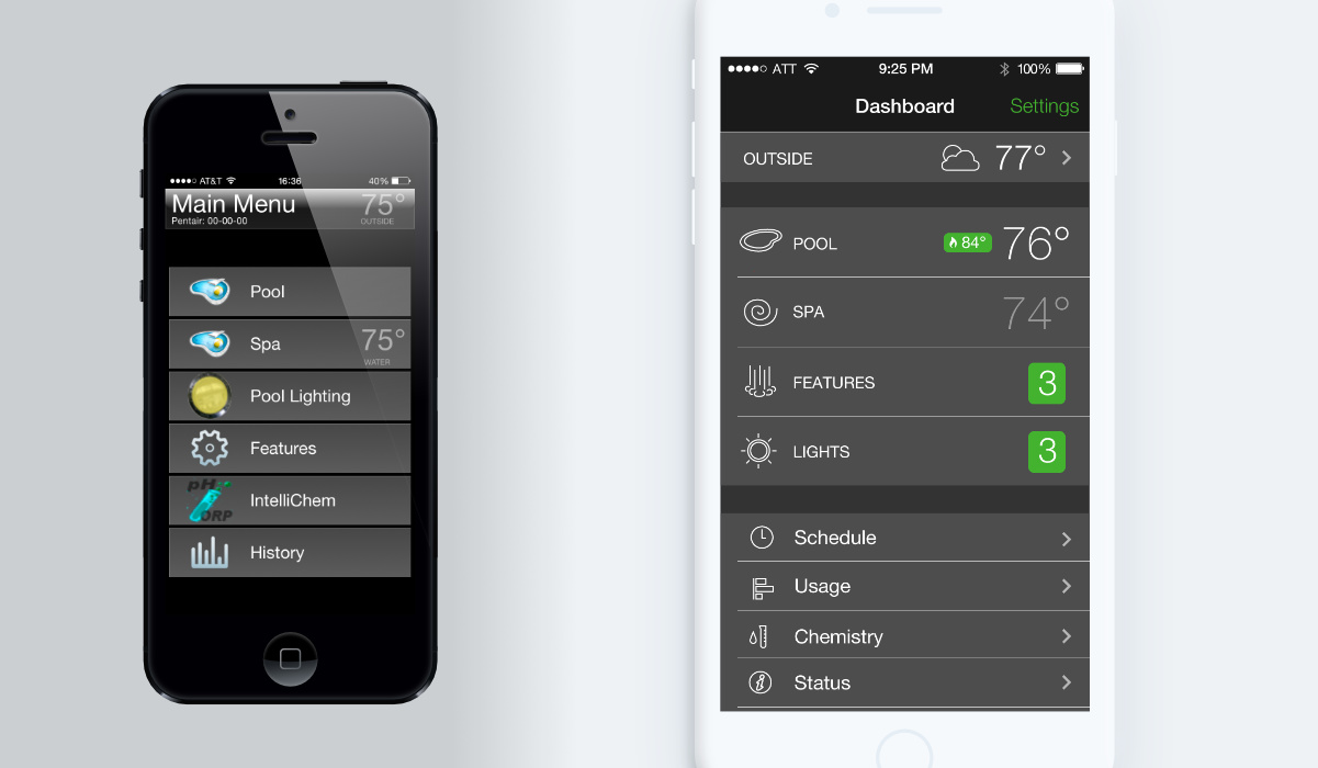
At Pathfinder, water equipment manufacturer Pentair engaged us to develop a new version of its ScreenLogic app. ScreenLogic was Pentair's control solution for residential pool installations: originally available as desktop software for Windows, it had been ported to iOS, bringing its fine-grained control over features ranging from thermostats to lighting and pumps to mobile devices.
While the original app was comprehensive, its developent from early in the days of the iPhone had not only dated it, but left it with a confusing information architecture. Its readability and affordance also suffered from non-standard UI controls that owed more to the legacy Windows app than contemporary mobile best practices.
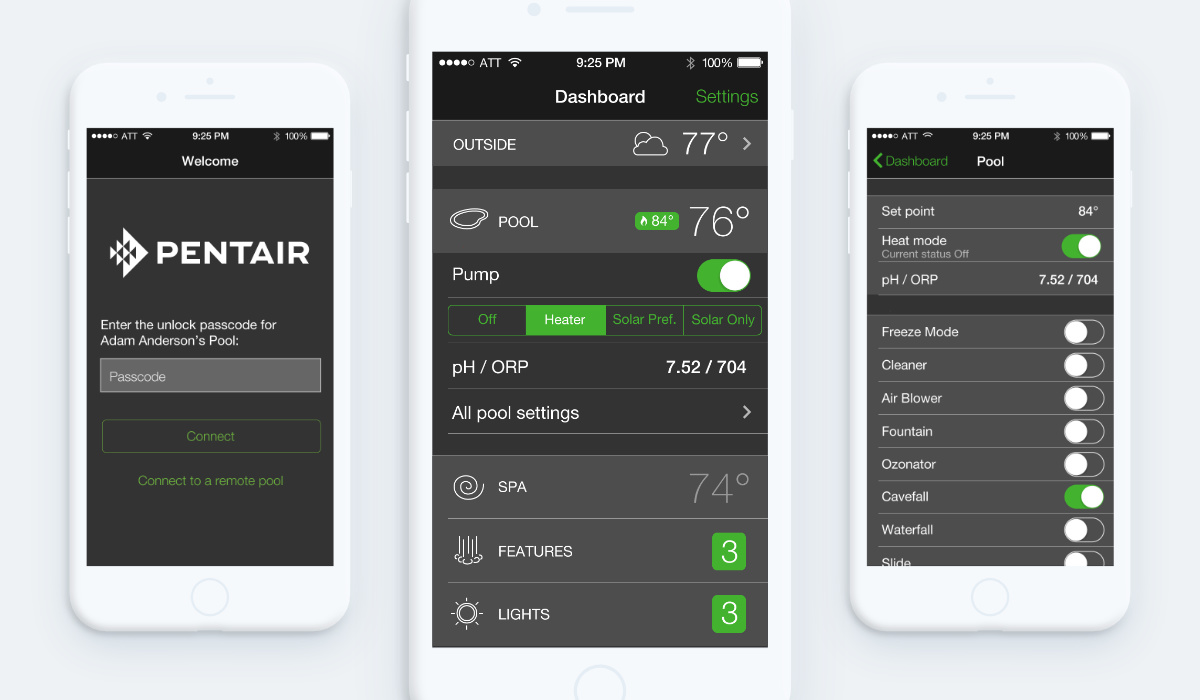
In the process of rethinking the app's information architecture, I worked with our team’s UX lead to identify information and functionality to lift out of deep menus and present either on the home screen or in contextual, progressive-disclosure elements.
These surfacings greatly helped alleviate pogo-sticking in the app, but left the home screen markedly busier than the original. To aid the screen's navigability, I proposed we break the features into multiple levels of hiearchy.
Together with the team, I divided the home-screen features into what we considered everyday use cases, such as checking or setting temperature, and occasional ones such as scheduling. This lent itself naturally to a common mobile UI pattern in which a few primary listview elements are presented at a large size, while others use the platform-standard minimum touch target height.
To complete the visual differentiation of elements on the home screen, I illustrated a set of minimalist icons with the goal of being both visually descriptive and geometrically distinct enough from each other that they would be differentiable at a glance and aid in building muscle memory.


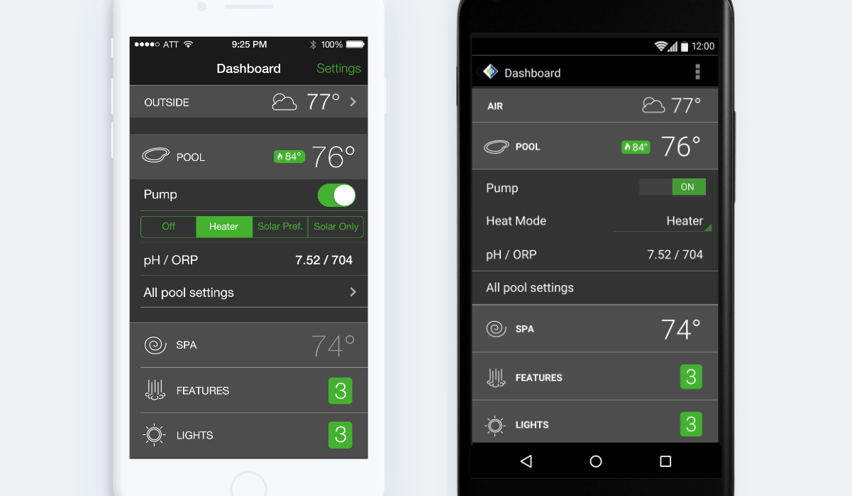
As a cross-platform app, ScreenLogic had to feel native in both iOS and Android contexts. To this end, I formulated a lightweight UI style that could flex between conforming to the iOS HIG or Material Design on Android.
Though the differences are sometimes subtle, details such as not using carats for listview navigation in Material Design make the difference between an app that feels cross-platform and one that feels truly native.
