Project44
Visibility Operations Center
Bringing high-volume, real-time data within reach

From POC to VOC
At Project44, I was part of the team building the Visibility Operations Center, a SaaS product used by high-volume shippers and third-party logistics companies to track freight across a variety of modes of transportation. Brought in as the first design IC just as a consultancy was rolling off the project, I would be responsible for taking the MVP to its next phase.
VOC had humble origins – it began life as a proof-of-concept for sales to demonstrate a possible implementation of the Project44 API. Over a period of a few years, it had grown into a product in its own right, positioned as a lightweight alternative to a full transportation management system focused solely on visibility.
One of my early challenges was to rein in the design language, initially a loose implementation of Material Design, into a more intentional design system that would better serve new functionality that was on the roadmap. A prime example was the Material "card" metaphor, which had been used all over as a largely decorative element rather than to establish visual hierarchy and communicate relationships in the UI. I stripped back its application from all but a few places, restricting its usage to entity-level components such as time-stamped tracking events and the aforementioned saved searches.
Common components, such as buttons, had some general patterns around usage in the MVP, which I formalized into more concrete rules around when to use each style. This pattern was something I repeated throughout my time at Project44, evolving and extending the nascent design system into somthing that could both aid front-end engineers as it was integrated into Storybook, as well as ease collaboration with other designers as we eventually added a second designer to the team.
Nailing down the timeline
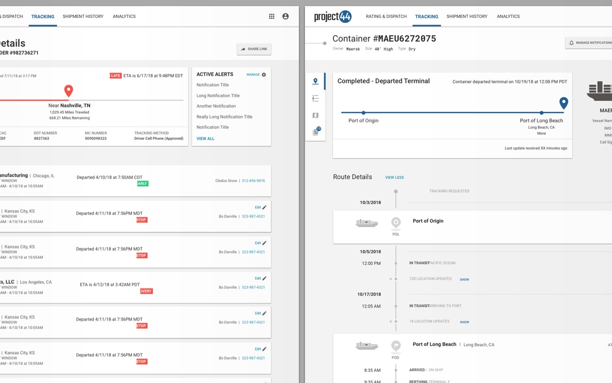
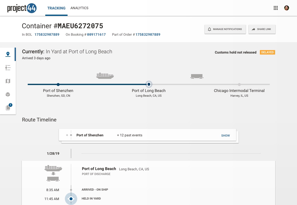
If the design system project began as an exercise in refining visual hierarchy, the tracking timeline was even more of one, posing an increasingly acute need as the scope of the VOC expanded to include other modes of transportation. Originally a big list of everything the tracking API had spit out, the usability of the timeline began to buckle under the weight.
Paradoxically, as the API had become more robust, the timeline became less helpful as it grew increasingly noisy with all the status updates. Working with the head of product design, customer success, and occasionally even actual track & trace personnel, I was able to narrow down what events were important to see when you landed on the page and which ones could be minimized, collapsed, or even omitted altogether.
For the main collapse-expand pattern, I proposed a "stacked card" metaphor to increase information scent by taking advantage of the more limited use of cards implemented in my earlier revisions to the design language. To aid in maintaining context (especially given the potentially large delta between collapsed and expanded states), I proposed an animated transition in which the collapsed card placeholders expand into the full cards. I worked closely with the front-end engineers to get the animations just right, prototyping them in both an animation tool and in-browser.
Sprints for the dash
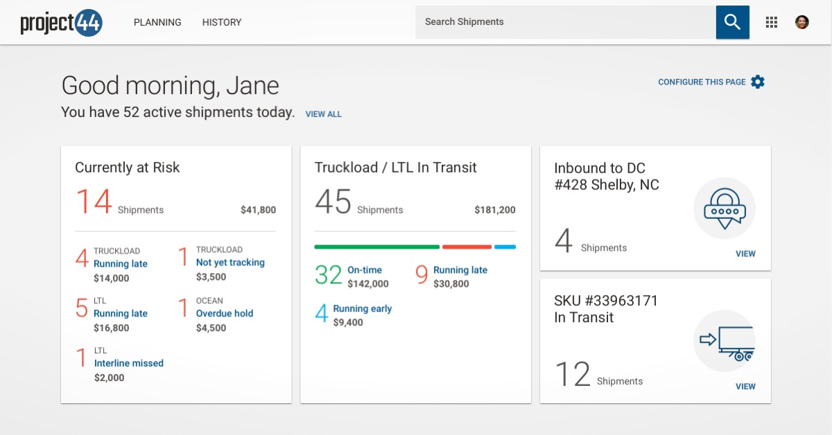
The VOC dashboard had grown from a simple list of shipments with a search box into a collection of saved searches, with a grid of cards representing each search, but this remained a static view, effectively hiding all activity happening around the shipments represented by those searches. It worked, but there was a big opportunity to surface information that could be valuable to our users.
As we approached a key industry trade show, the VOC roadmap called for a refresh to the dashboard to address this opportunity. Different groups within the organization had different priorities for this refresh: According to customer success, our users wanted to be alerted of things inside searches. Management wanted the UI to hew closer to our new brand standards. Sales wanted to integrate analytics to sell to more strategic users.
With the VOC's product manager, we established that the top priority for the dashboard, beyond its current role of drilling into shipments, was to surface risk. This led us to a few categories of risk that could be quantified by a status, captured in a search, and rolled up into a dedicated risk tile on the dashboard. We even added a dollar value estimate for each category – while most of our customers didn't yet have the ERP integration that would feed it, engineering was able to implement it as a proof-of-concept. For existing search tiles, we simply showed the number of results within that search, giving the old and new tiles a neat continuity.
Sales really wanted to see some kind of data visualization – even a simple one – because they tend to play particularly well with decision makers. While we had a robust Tableau implementation that we offered for in-depth analysis, we determined there could be some value to track-and-trace users with a risk visualization on the dashboard. I designed a simple, stacked bar chart to offer a glancable view of on-time status as a proportion of everything currently in transit.
Lastly, I further iterated on our design language in collaboration with the marketing team. We arrived at a functional, yet on-brand visual refresh that took some of the lighter typographic weights and emphasis on line illustrations into a revamped font hierarchy and new iconography. The demo was a success, with a warm reception at the show.
Going off the map
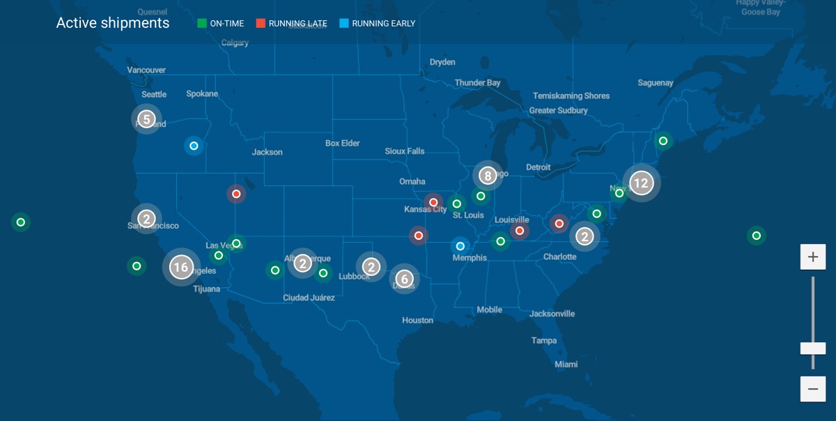
For the entirety of the VOC's history, we had used HERE Maps. HERE's product offered rich roadway data that helped in calculating freight routes on the backend, but its front-end left a lot to be desired. Its client rendering had long since been eclipsed by Google Maps' smooth-zooming and flexible WebGL renderer, still relying on pre-rendered tiles as its biggest competitor had since the mid-2000s. Beyond the dated interactive experience, HERE's non-configurable, baked-in visual theme looked ungainly next to more modern alternatives.
Google Maps was out, as it we couldn't justify the expense for what would ultimately be modest gains in terms of being able to refine geographic visual hierarchy and offer smoother map navigation. I investigated a few other alternatives, and found one I felt was particularly promising, that also carried a pricing structure much more compatible with our needs: MapBox.
The VOC's product manager was with me on this, having wanted to change front-end map providers for some time. Together with the head of product design, we made a business case for switching to MapBox, initially just on the home page, leaving the HERE implementation on shipment detail pages for the time being.
The MapBox pilot got the green light, and I dove in with the front-end engineers to customize the map display for our needs, including a long-desired clustering behavior that HERE had never supported. I gained proficiency with MapBox Studio, authoring a new map style to coordinate with the home page and our typographic system, completing the newly refreshed VOC dashboard.